
A brand is not a logo.
It is a decision.
Every brand we build could have turned out differently. Louder. Cheaper. More interchangeable. That it did not is because somebody decided, before the first colour was set.
Arrange a conversationTwo clients. Both sell food. Both could have shouted.
The reflex in hospitality is the discount. Big numbers, signal colours, exclamation marks. It works briefly and leaves the brand a little more ordinary afterwards.
A logo is the result, not the work. The work is the decision before it: what the brand stands for, and what it stands against. What it shows, and what it leaves out. A brand system holds that decision in place so it is not renegotiated with the first flyer.
Switch between them.
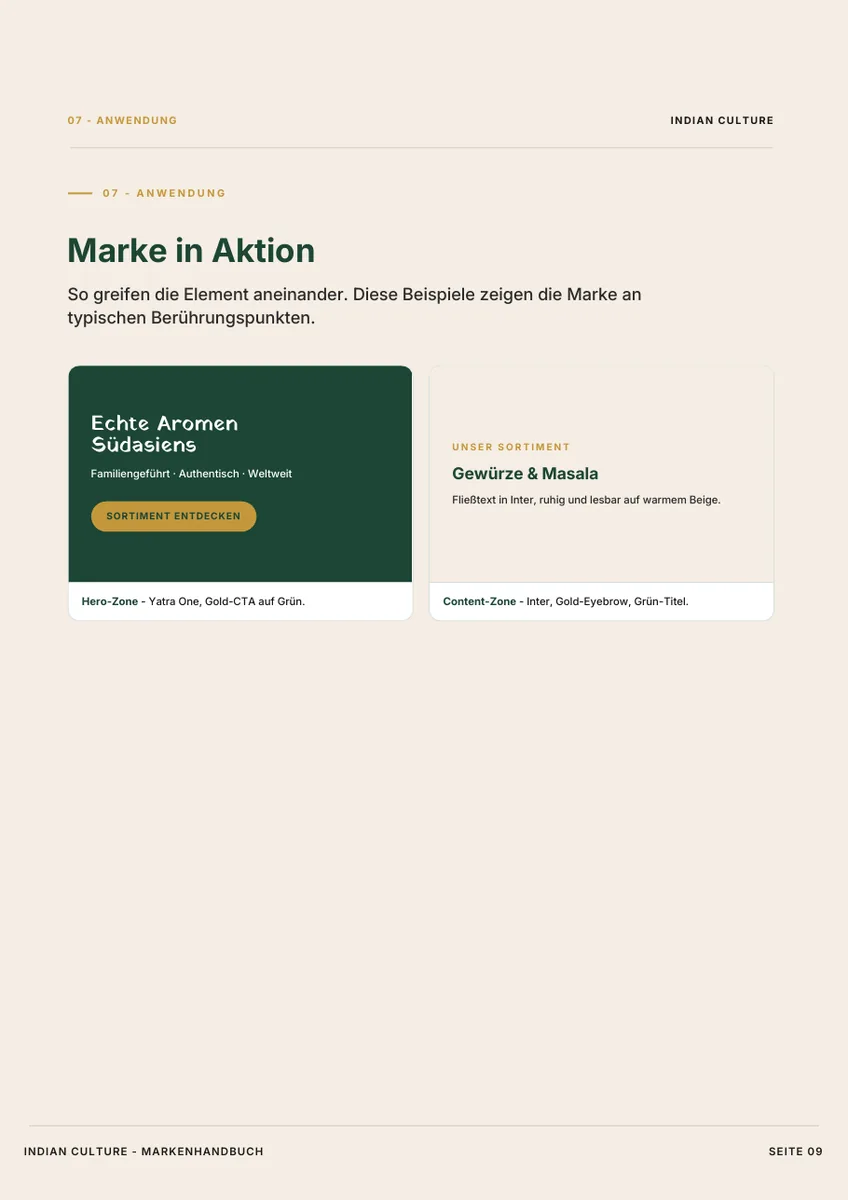
These are not excerpts. Both books are here in full, page by page, exactly as the client received them. Pick a brand and scroll through.
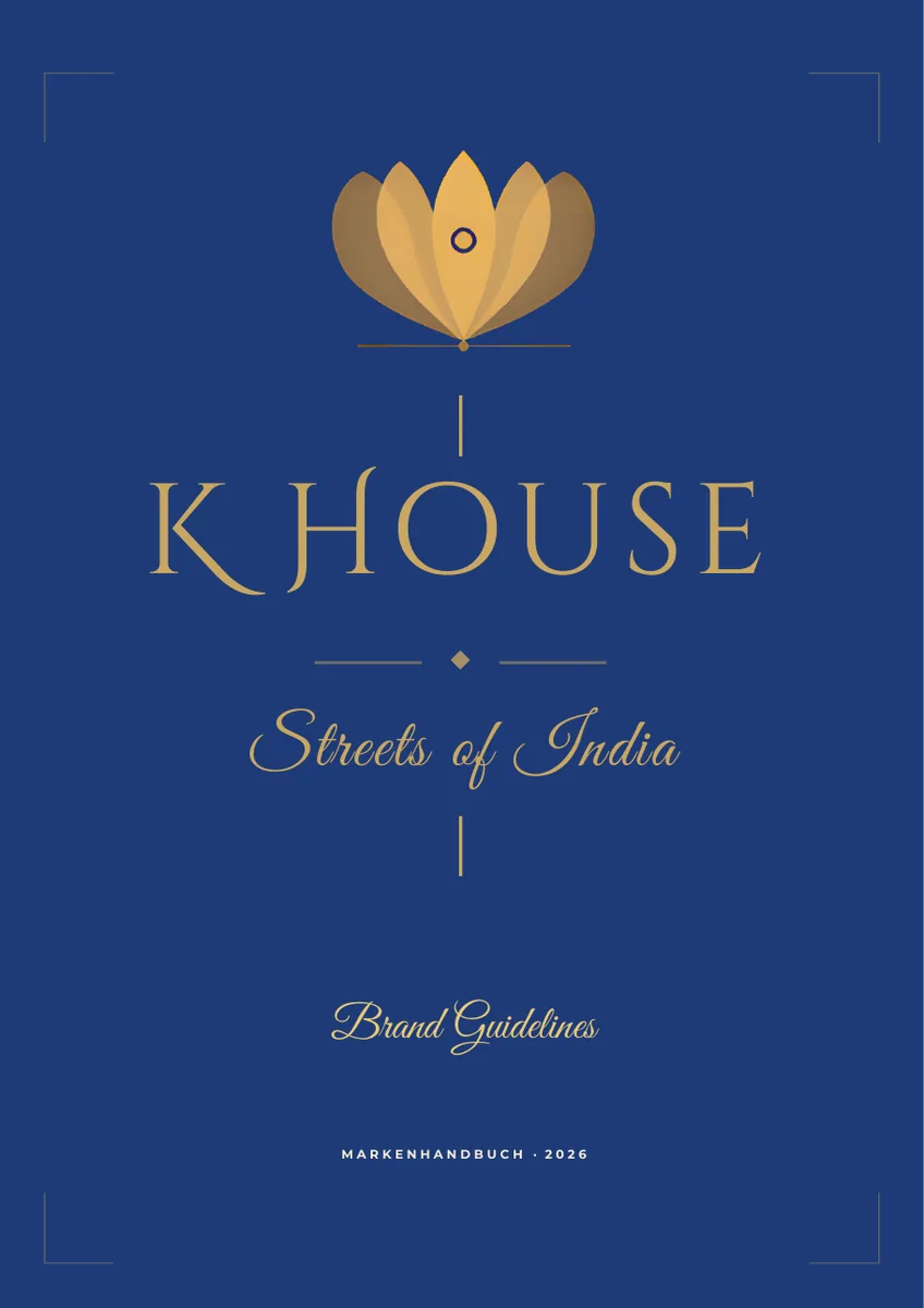
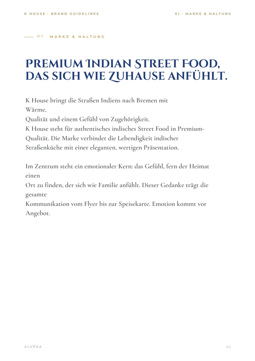
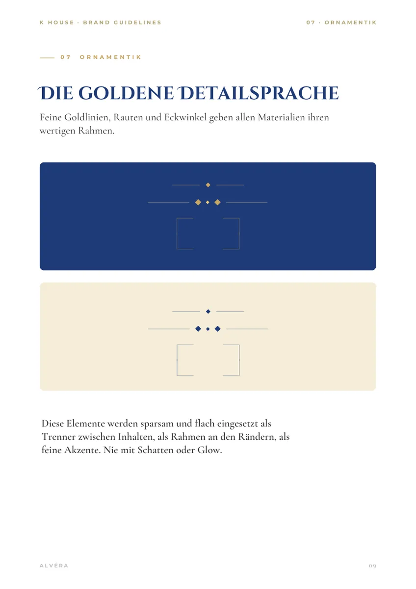
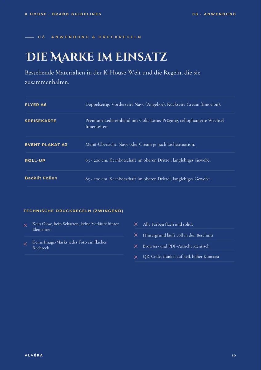
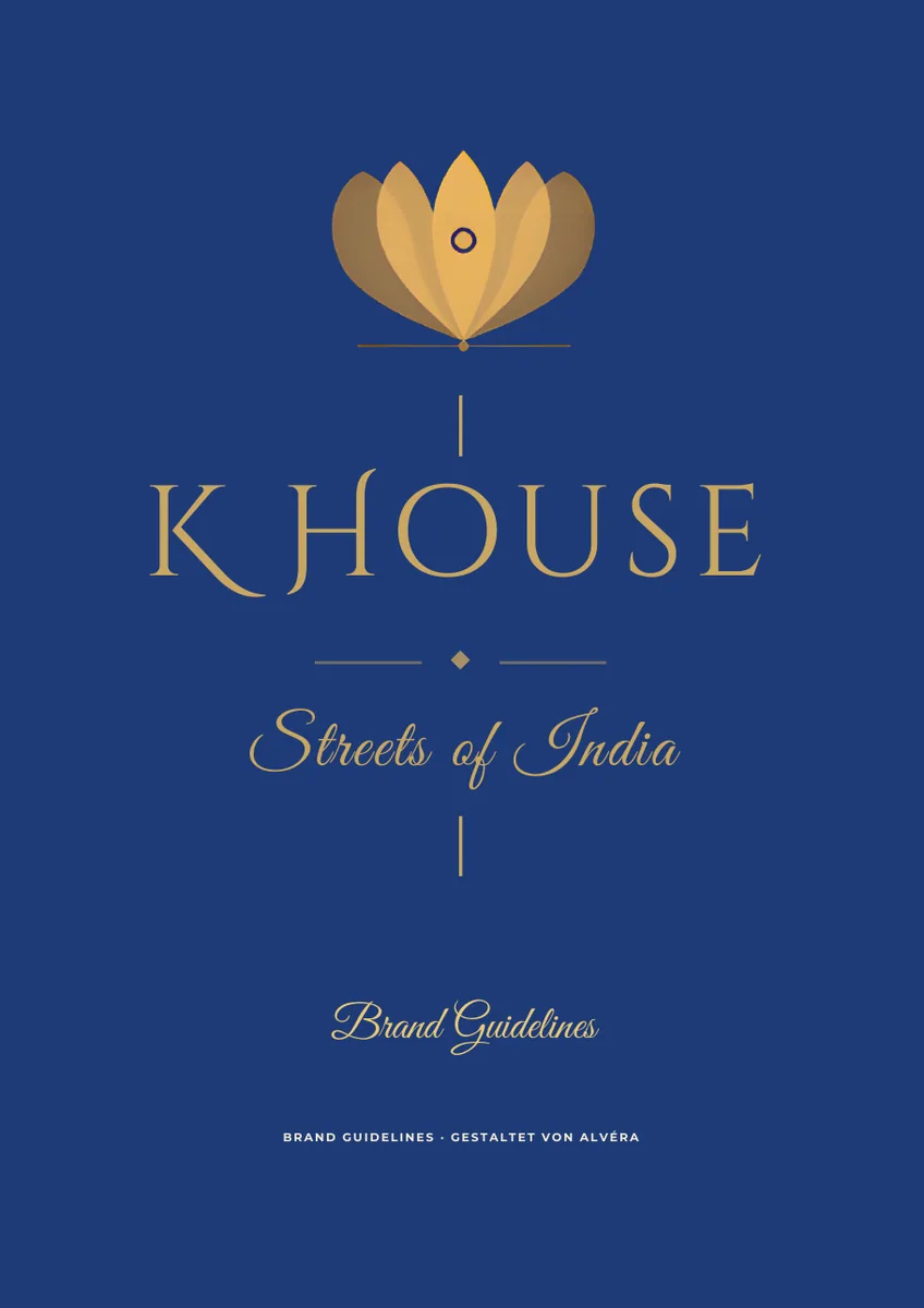
The obvious answer for Indian street food is colour. Saffron, chilli, turquoise, plenty of it. K House became navy and gold. The reason is in the book, in four words: emotion comes before offer.
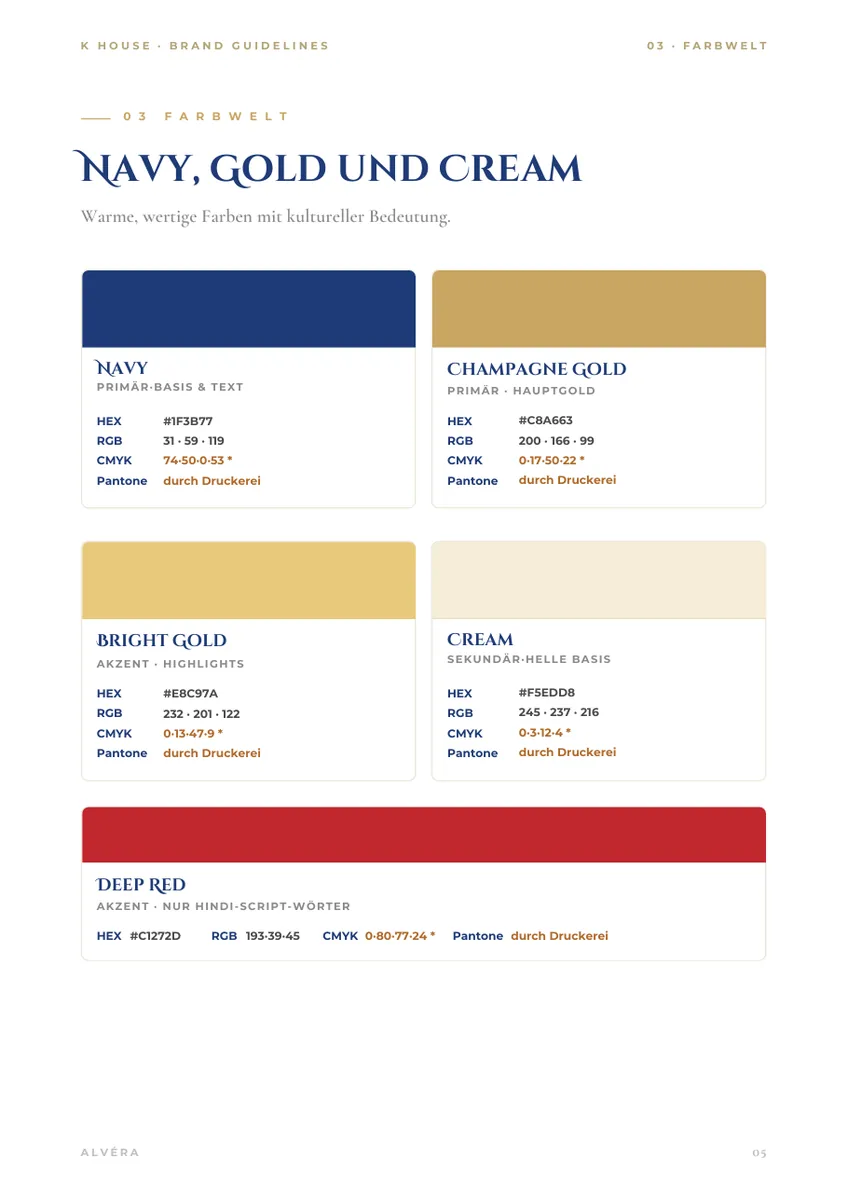
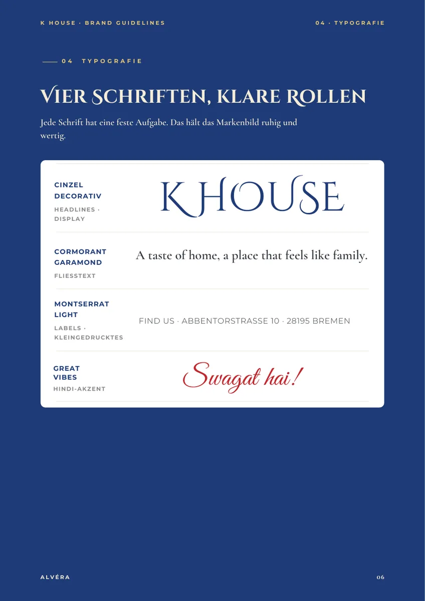
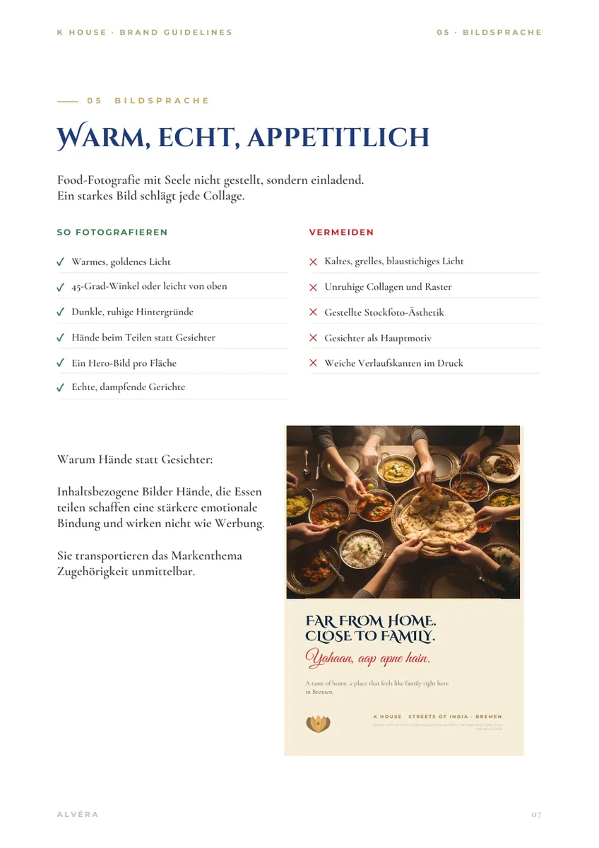
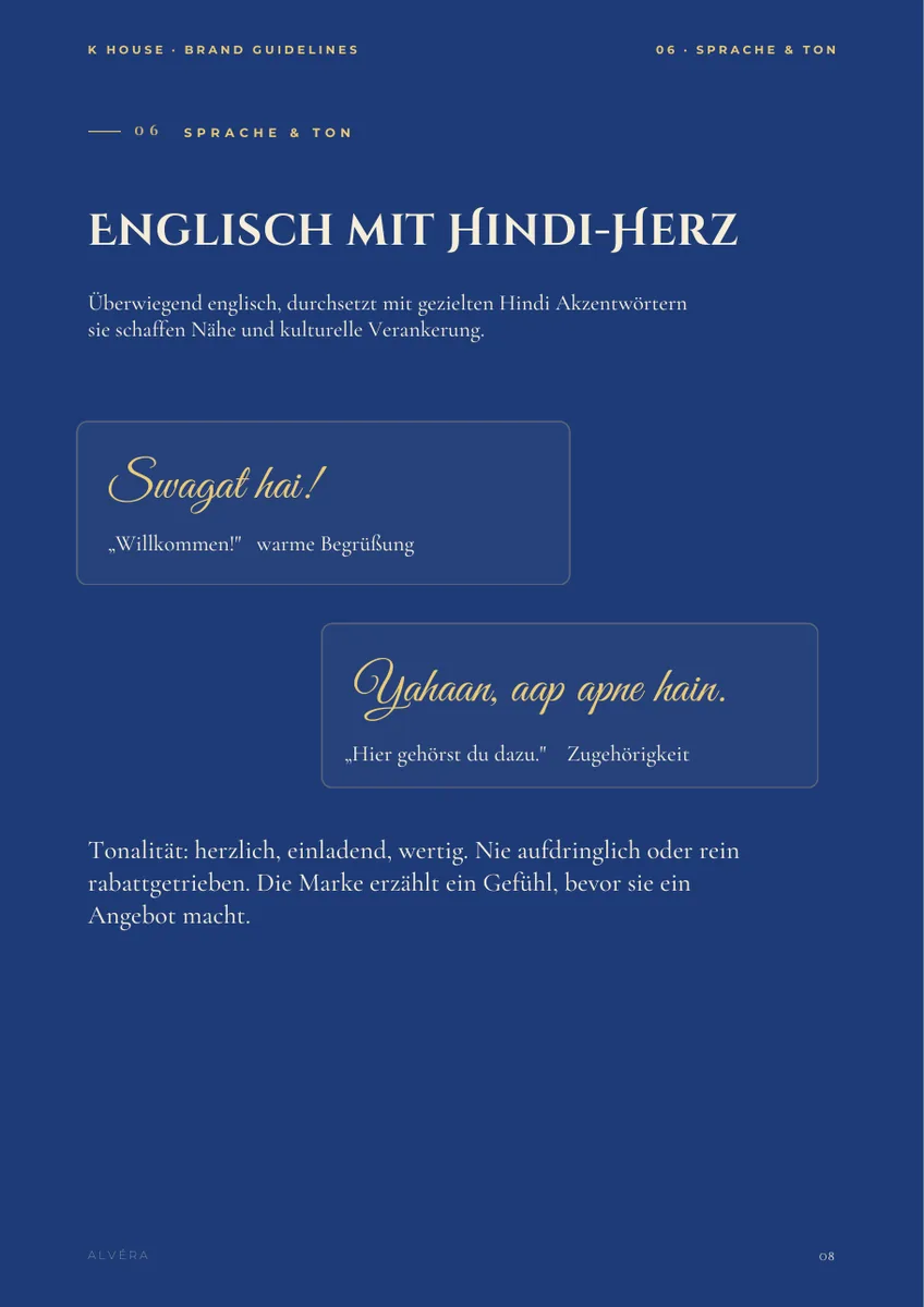
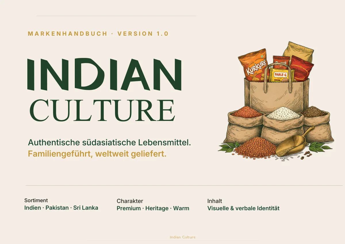
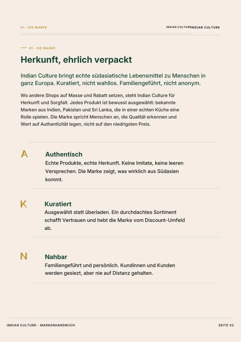
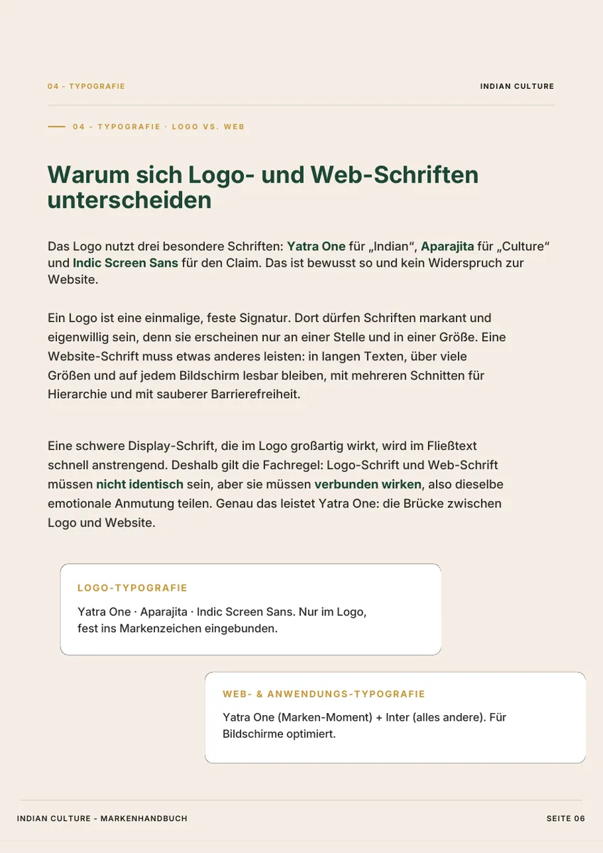
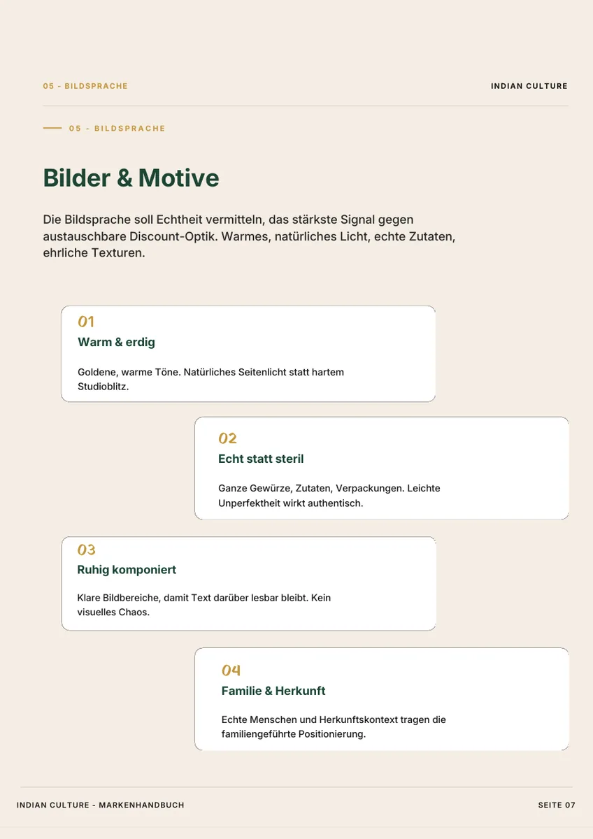
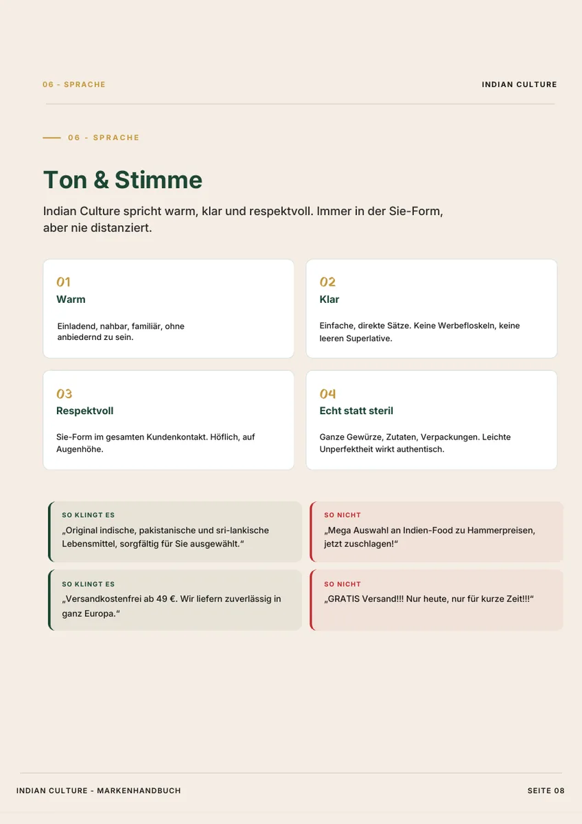
A shop for South Asian groceries competes with discounters. The comfortable route is well trodden: volume, discount, exclamation marks. Indian Culture took the other one.
What you end up with
- Logo
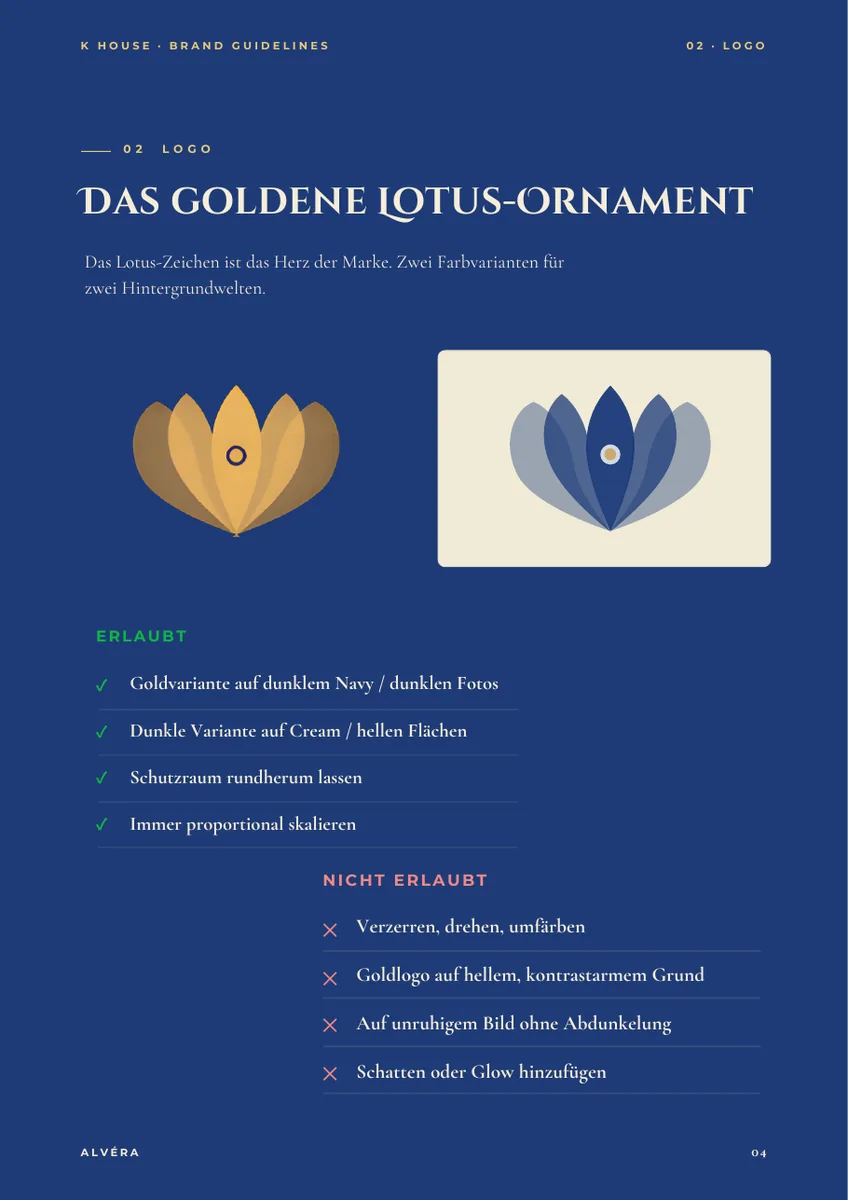
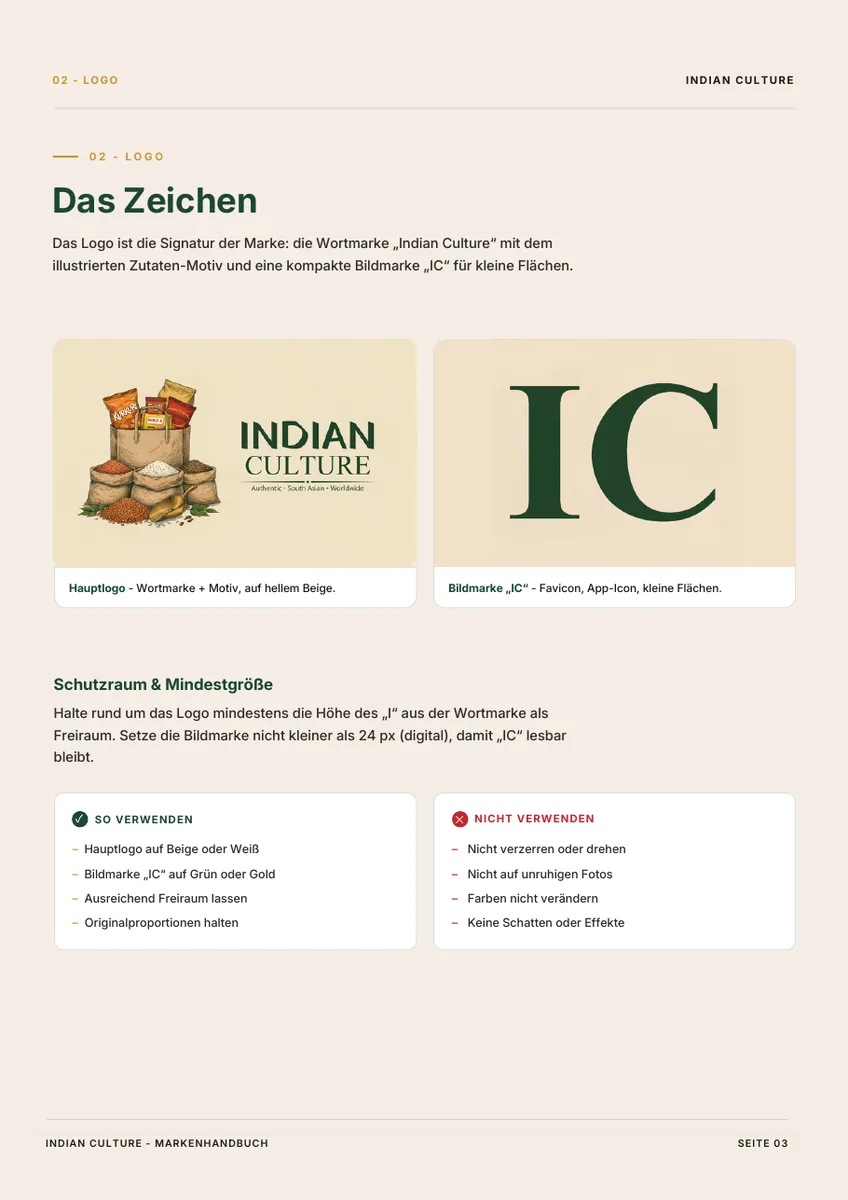
- Wordmark, symbol, variants for dark and light surfaces, clear space and minimum sizes.
- Colour system
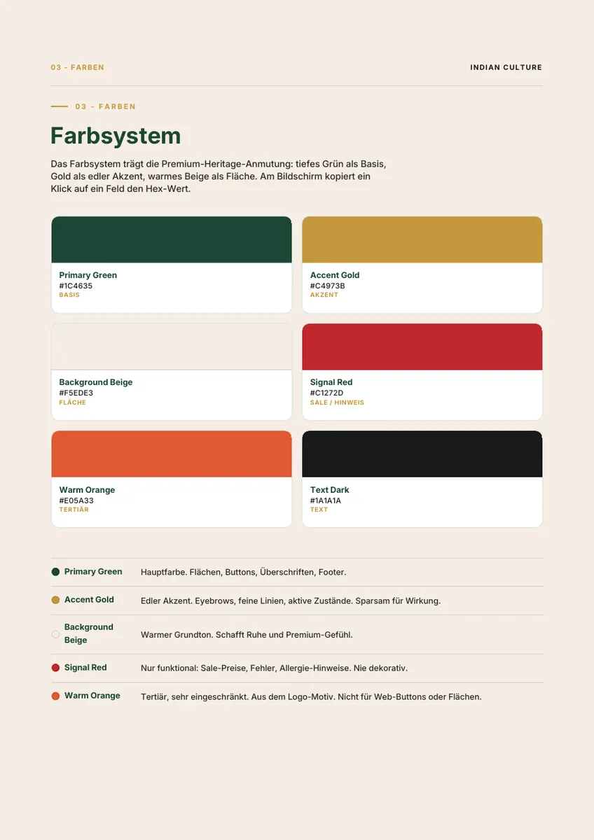
- HEX, RGB, CMYK. With rules for what each colour is for, and what it is expressly not for.
- Typography
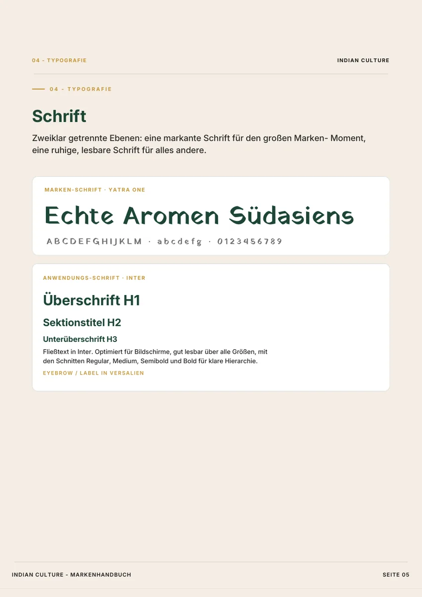
- Typefaces with fixed roles. Separate for logo and application, with the reasoning behind it.
- Image language
- What gets photographed and what does not. Light, angle, subject, composition.
- Tone of voice
- How the brand speaks, with examples of how it does not speak.
- Packaging design
- Folding cartons, labels, dielines. Print production included on request.
- Brand book
- Everything in one document that also makes sense to someone who was not there.
What clients ask beforehand
What belongs to a brand identity besides the logo?
A logo is the result, not the work. A complete brand identity includes the logo with variants and clear space, a colour system in HEX, RGB and CMYK, typography with fixed roles, image language, tone of voice, and a brand book that holds it all together.
Why do the logo typeface and the web typeface differ?
A logo appears in one place at one size, so its typeface can afford to be idiosyncratic. A web typeface has to stay readable across long texts, many sizes and every screen. The two need not be identical, but they must feel connected and share the same character.
Is packaging design included?
Yes. Folding cartons, labels and dielines are developed on the basis of the brand system. On request we also handle the entire print production.
Which decision is waiting on your side?
Tell us what you sell. We will tell you where the comfortable route runs and why it is rarely the right one.
Free. No obligation. No sales pressure.