
Top Fresh Sushi is a sushi restaurant in Harburg, a borough on the southern side of Hamburg in northern Germany. We designed the menu and handled print production, from the format and structure through to the paper.
The menu is the one piece of material in a restaurant that every guest can be relied on to pick up. It shapes how quickly someone gets their bearings and what they end up ordering.
Why sushi menus turn cluttered faster than most
Sushi has a lot of individual items. Maki, nigiri, sashimi, inside out rolls, specials, plus starters and drinks. Pushed onto two pages without order, that becomes a list in which the guest loses their footing and defaults to the roll they already know.
That is a design problem, not a law of psychology. The choice overload effect often cited in this context is contested. A meta-analysis by Scheibehenne, Greifeneder and Todd, published in the Journal of Consumer Research in 2010, covered 63 conditions from 50 experiments and found a mean effect size of virtually zero, with wide variation between individual studies. The problem with a cluttered menu is therefore not that too many options paralyse the guest. It is simply that they cannot find what they are looking for.
How we built the menu
Panoramic landscape format, two sides. The landscape format gives each category room and carries the eye linearly from left to right. That is not a matter of taste. Sybil S. Yang used an eye tracker to measure how guests actually read menus and published the results in 2012 in the International Journal of Hospitality Management. They read sequentially, like a book, from top left to bottom right, and they read slowly, which indicates reading for information rather than scanning. A layout that follows that movement works with the guest rather than against them.
Categories built for finding, not for remembering. We grouped by sushi type rather than by price or kitchen logic, because that is the language the guest thinks in. The common justification, that more than seven items per group overloads working memory, rests on Miller 1956 and is a misapplication. The Nielsen Norman Group states it plainly: with visible lists, recognition applies rather than recall. A printed menu lies in front of the guest, who has nothing to memorise. We grouped anyway, but so that they arrive faster.
Signature rolls at the top of their group. Not in a supposed sweet spot zone. The industry rule about the golden triangle does not come from a study but from a diagram passed along for decades, and Yang's measurements found no such area. What she did find was the opposite: a zone that received notably little attention. Whatever comes first in a group gets read first. So that is where the items that should sell now sit.
Photography only where it earns its place. Only the signature items are photographed. Everything else stays typographic. Too many images make a menu restless and pull perceived quality down, which is exactly the direction a premium sushi restaurant needs to stay away from.
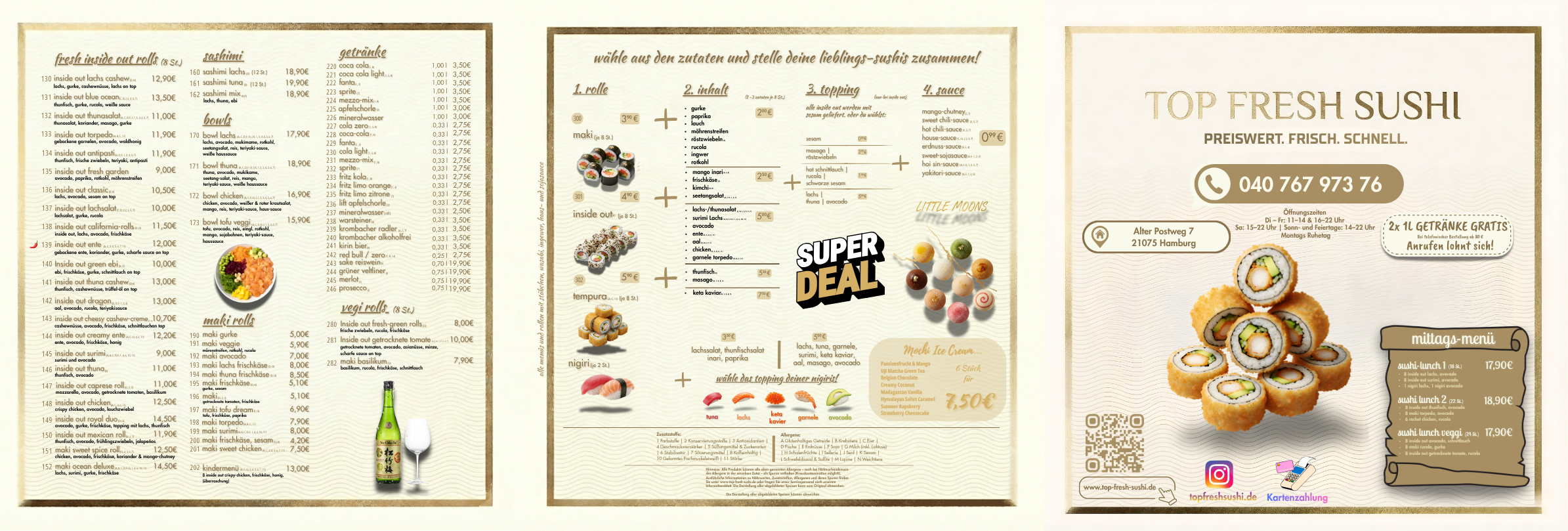
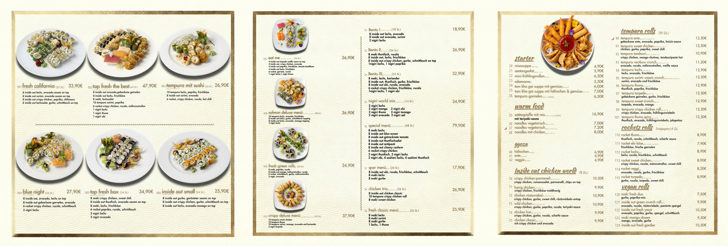
Print production handled end to end. From the press-ready artwork through to the choice of paper. For menus in a working restaurant, weight, surface and wipeability decide how the menu looks after four weeks. A well-designed menu on the wrong stock is an expensive misunderstanding.
Why there is no performance figure in this case study
Because we did not collect one.
Proving that a menu lifts the average check would require sales data from before and after, adjusted for price changes, seasonality and changes to the range. That analysis was not part of the brief, and without it any percentage would be a guess.
We could insert a figure from an industry source here. It would then be another restaurant's number published under the name of Top Fresh Sushi. So there is none.
What can be said is what was designed and why. Where an effect was measurable, the figure appears with its period and method in the relevant case study.
What this means for other restaurants
Many operators treat the menu as an administrative document. It is designed once and then only touched when prices rise or a dish comes off. Yet it is the only material every guest is guaranteed to read, and the minutes spent on it work either for the business or against it.
Three questions any operator can ask themselves. Does a guest find their category within a few seconds? Does each group lead with the item that should sell? And does the menu still look the way it did on day one after a month in service?
For what a menu project costs and what drives the price, see our branding cost guide.
Sources
Yang, S. S. (2012): Eye movements on restaurant menus. A revisitation on gaze motion and consumer scanpaths. International Journal of Hospitality Management.
Scheibehenne, B., Greifeneder, R., Todd, P. M. (2010): Can There Ever Be Too Many Options? A Meta-Analytic Review of Choice Overload. Journal of Consumer Research 37 (3), 409 to 425.
Nielsen Norman Group: How Chunking Helps Content Processing, on why limiting visible lists to seven items does not apply.
Next step
If your menu is hard to navigate, does not match the concept, or does not survive service, we will look at it and tell you whether a redesign is worth it or whether targeted fixes will do. Start the free analysis, three minutes, no obligation.
Similar results for your company?
Free analysis in 3 minutes.
Start analysisOr directly: +49 176 4047 1079