
Premium Food is a kebab shop in Hamburg-Harburg with high standards in the kitchen and none of that visible from the street. We rebuilt the facade, the interior and the menu, and handled print production.
Doner kebab is not a niche in Germany. The trade association of Turkish doner producers in Europe puts the German industry at roughly 2.4 billion euros a year and around 60,000 jobs. To a customer walking past, almost all of it looks the same: a light box, a photo wall, a price list. A shop that does not stand out in that density is not compared. It is simply not seen.
Why a good shop still gets overlooked
Premium Food had everything the name implies: quality ingredients, care in preparation, a decent room to sit in. What it did not have was a visual identity that said so from the outside. The signage had grown over years rather than been designed, the menu was a stopgap, the wall space inside was unused.
The problem is one of sequence. A guest only experiences the quality once they are inside. What decides whether they go in at all is the facade and the entrance. Between the quality Premium Food delivers and the perception of that quality sat a gap, and that gap was a design problem, not a kitchen problem.
What we designed for Premium Food
Three visible layers, aligned with each other, plus the production behind them.
Facade graphics. The first point of contact and the only one that works at a distance. Designed to be legible on foot and from a passing car, with artwork that still reads at night and when parked cars cover part of it.
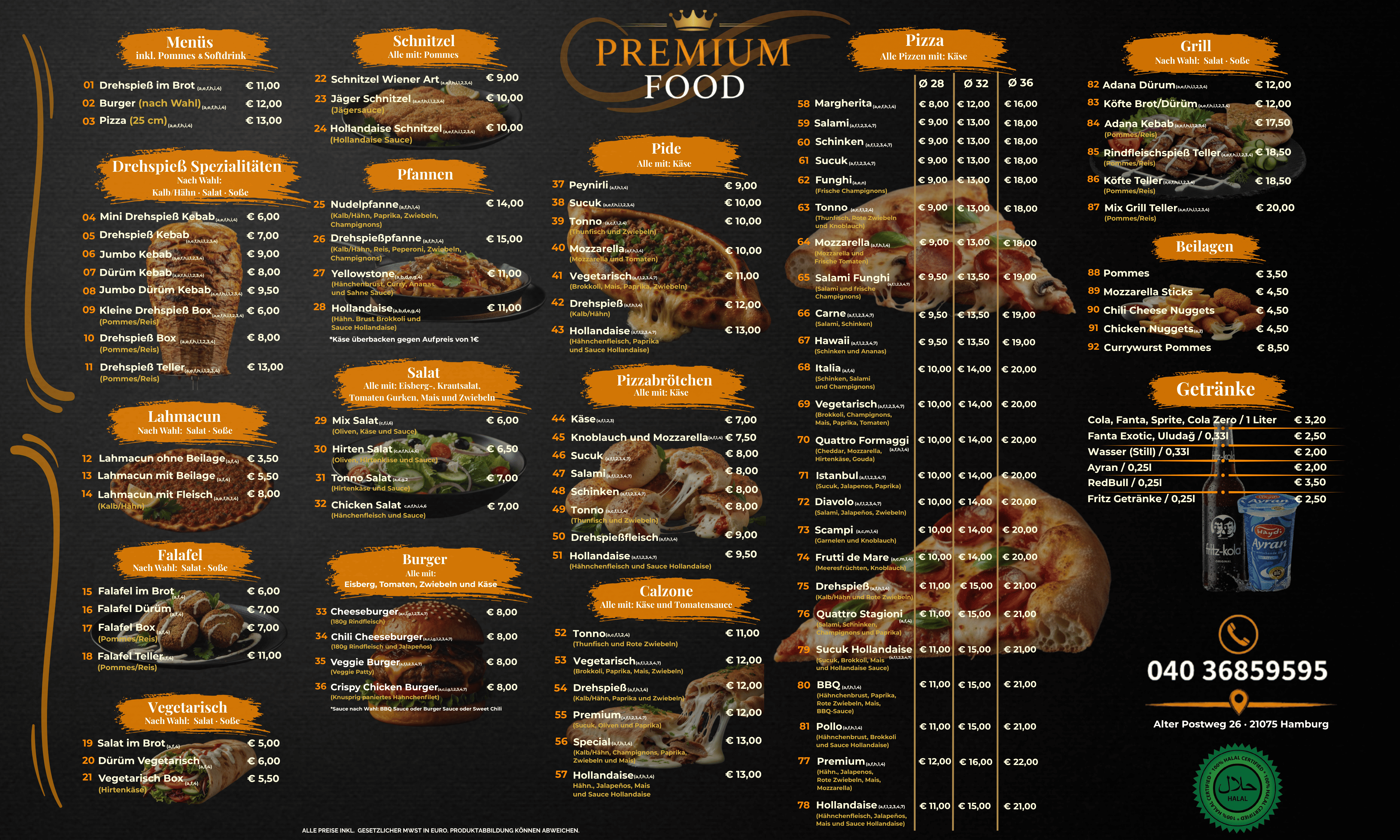
Rigid PVC foam board panels for the interior. The underrated medium in hospitality. Unlike posters or vinyl, foam board looks considered, survives grease, steam and cleaning agents, and carries a message exactly where the guest is already waiting.
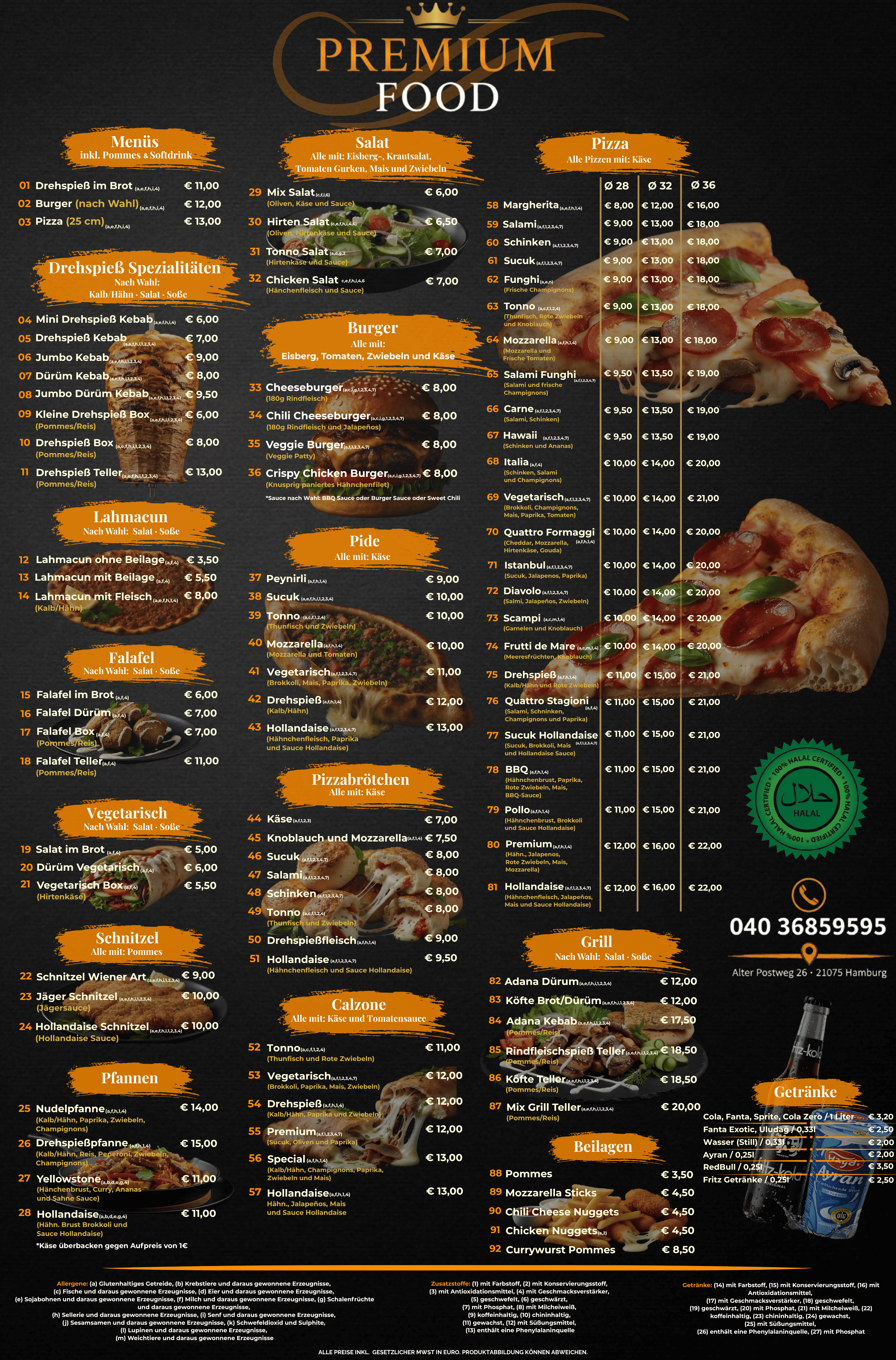
The menu. The only material almost every guest physically picks up. Structure and reasoning in the next section.
Print production. Material, weight and process are part of the design, not an afterthought. A good menu on thin stock feels cheap, and facade graphics on the wrong film peel after one winter. We selected both and supervised the production.
Why we did not build the menu around the golden triangle
Hospitality has a rule about menu layout called the golden triangle, or the sweet spot. The eye supposedly lands in the middle of the page, then moves to the top right, and that is where the high margin dishes belong. The rule does not come from a study. It comes from a diagram by the graphic designer William Doerfler that the industry passed along for decades.
Sybil S. Yang tested it with an eye tracker and published the results in 2012 in the International Journal of Hospitality Management. Guests read menus sequentially, like a book, from top left to bottom right, and they read slowly, which suggests reading for information rather than scanning. There was no area where the gaze rested longer or returned more often. There was the opposite: an area that received notably little attention.
For the Premium Food menu that means three things.
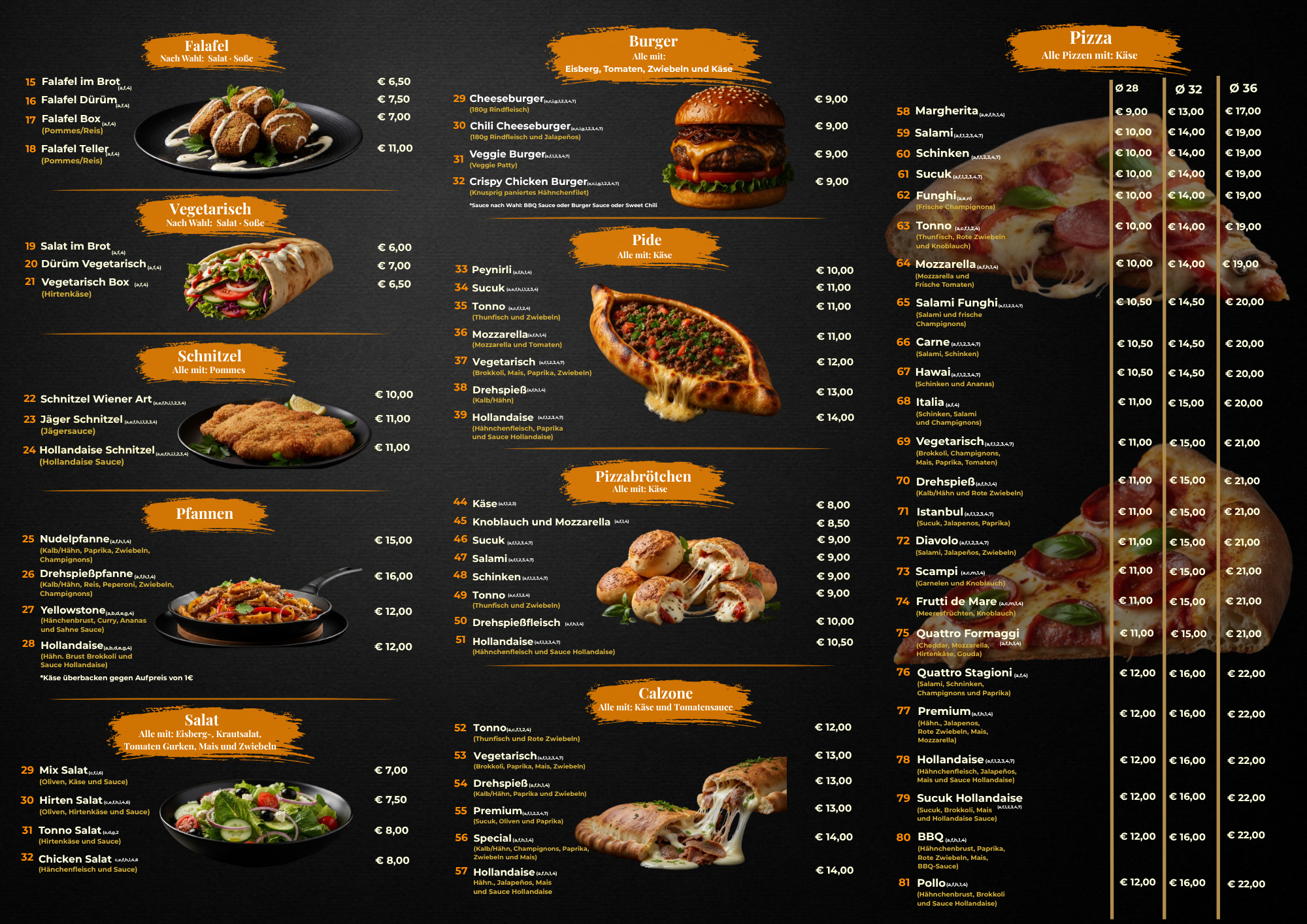
Order beats position. What comes first gets read first. The signature items therefore sit at the top of their group, not in a supposed sweet spot zone.
Groups exist for finding, not for remembering. The common justification, that more than seven items per group overloads working memory, rests on Miller 1956 and is a misapplication. The Nielsen Norman Group states it plainly: with visible lists, recognition applies rather than recall. A printed menu lies in front of the guest, who has nothing to memorise. We grouped anyway, but so that the guest reaches their category faster.
The margin is not a dumping ground. Yang's low attention area has a practical consequence. General information about the business can live there. Items you want to sell cannot.
What Premium Food has now
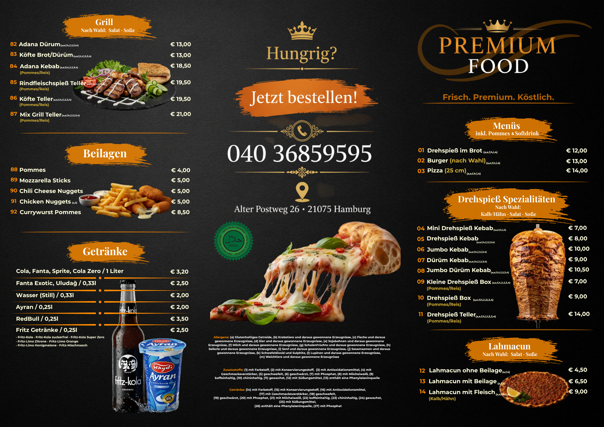
An identity that makes the same statement at every point. The facade graphics promise what the interior panels continue and what the menu delivers. Before, each of those three was a separate handwriting from a different year.
Durability comes with it. Materials and processes were chosen to survive a working kitchen environment, which means grease, steam, cleaning agents and direct sun on the facade.
Why there is no percentage in this case study
Because it could not be measured.
Premium Food is quick service. A large share of guests arrive without a booking, pay cash and leave no trace that could be assigned to a period. There is no system that produces a clean before and after, and no reservation data from which walk-in traffic could be reconstructed.
We could put a number here. Nobody could verify it, ourselves included. So there is none.
What can be said is what was not there before and is there now: a consistent identity across three touchpoints, produced to a standard that lasts. Where an effect is measurable, the figure appears with its measurement period and method in the relevant case study.
What this means for other hospitality businesses
Many operators invest in product quality and service and economise on the visible identity. That is not a saving. It moves the risk forward. The quality that was paid for only becomes visible after the guest has decided. The design comes before that.
Three questions any operator can ask themselves.
First: From twenty metres away, can someone tell what is sold here and at what level?
Second: Do the facade, the interior and the menu say the same thing, or are they three handwritings from three different years?
Third: Does the menu lead with what you actually want to sell?
If any of the three answers is uncomfortable, that is where the leverage is. What a complete visual identity costs depends on scope. The ranges and the factors that drive them are in our branding cost guide. For an overview of the disciplines that work together on a project like this, see design and marketing from one source.
Sources
Association of Turkish Doner Producers in Europe (ATDID), industry figures on revenue and employment, atdid.de, accessed 3 August 2026. The figures carry no publication date on the source page.
Yang, S. S. (2012): Eye movements on restaurant menus. A revisitation on gaze motion and consumer scanpaths. International Journal of Hospitality Management.
Nielsen Norman Group: How Chunking Helps Content Processing, on why limiting visible lists to seven items does not apply.
Next step
If your business is ahead on quality but behind on how it looks, we will go through the touchpoints and tell you which one carries the most weight. Start the free analysis, three minutes, no obligation.
Similar results for your company?
Free analysis in 3 minutes.
Start analysisOr directly: +49 176 4047 1079