
OKI Street Café is an owner-run café in the Colonnaden in central Hamburg, surrounded by three coffee chains. We built the brand, the print materials, the social media presence and the platform profiles.
The neighbourhood is the whole point. Espresso House sits 43 metres away on Gustav-Mahler-Platz, Starbucks 198 metres in a straight line on Neuer Jungfernstieg, and von Allwörden, a bakery chain with outlets across northern Germany, is within sight. Opening a café there does not mean competing with the café next door. It means competing with brand recognition built over decades.
Why the location alone was not enough
The concept behind OKI Street Café was sound from the start: good coffee, Asian-inspired snacks, a street café atmosphere, and an audience in the Colonnaden that matched.
What was missing was everything that sits between a guest and their decision. On Google Maps, Apple Maps and TripAdvisor, OKI was barely present. Social media did not show what actually happens in the shop. The print materials in the café did not pick up the brand. And the visual identity was not distinct enough to read as its own address rather than a smaller version of a chain.
The headwind was structural. In 2025, adjusted for inflation, German hospitality recorded its sixth loss-making year in a row, with real revenue 14.8 percent below the pre-crisis year of 2019. For food-led hospitality alone, the gap in the first half of 2025 was 17.4 percent.
What we did
The obvious move would have been to compete on the chains' terms. Similar offer, similar look, slightly cheaper. We did the opposite: maximum distinctiveness on every channel a guest touches before walking in.
Brand design. An identity built deliberately not to look like a chain. Starbucks is green and round, Espresso House warm and wooden, von Allwörden classically north German. OKI stands for street culture, energy and Asian influence, and the logo, colour system and typography are built so that the brand does not blur into the others in an Instagram feed.
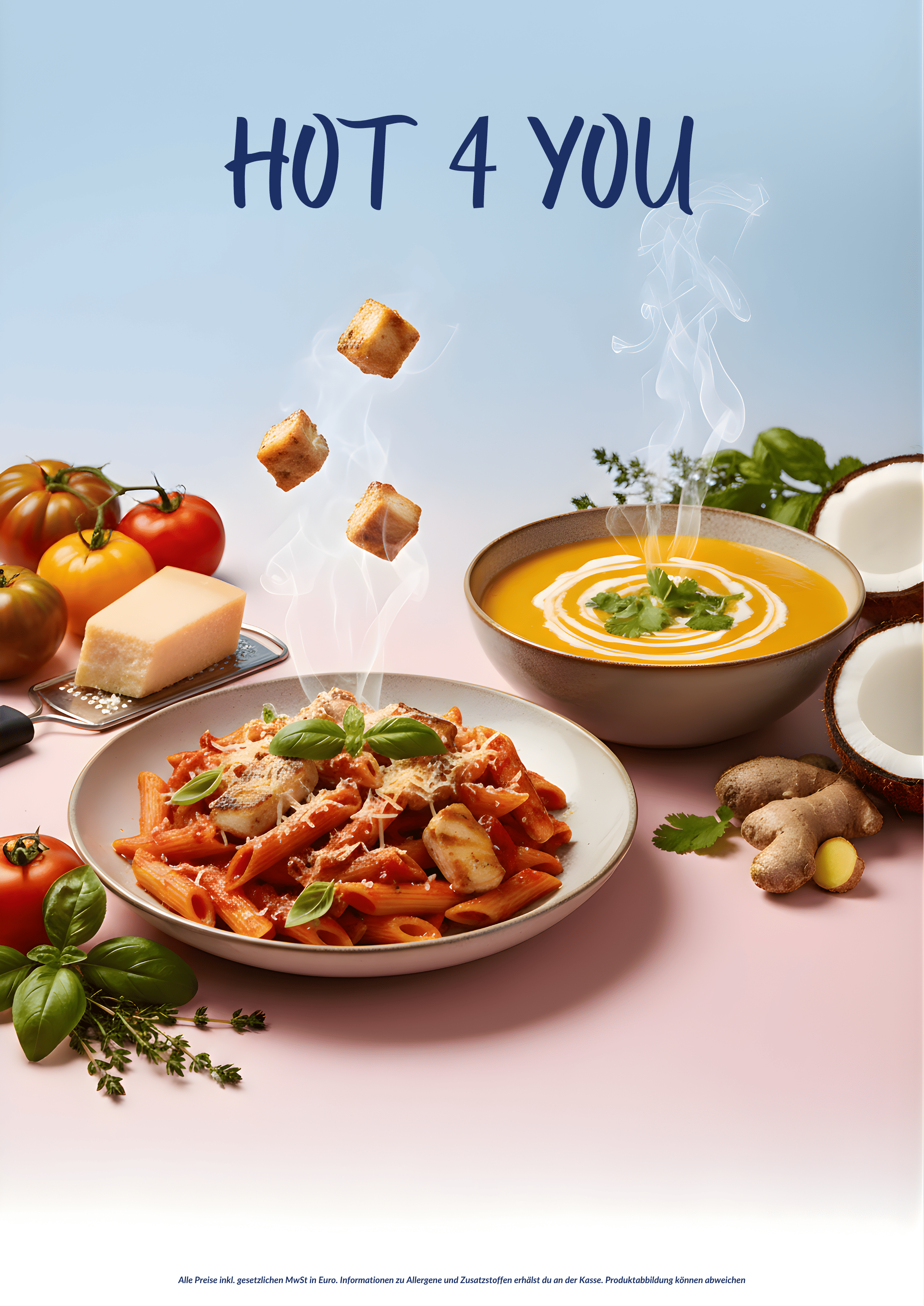
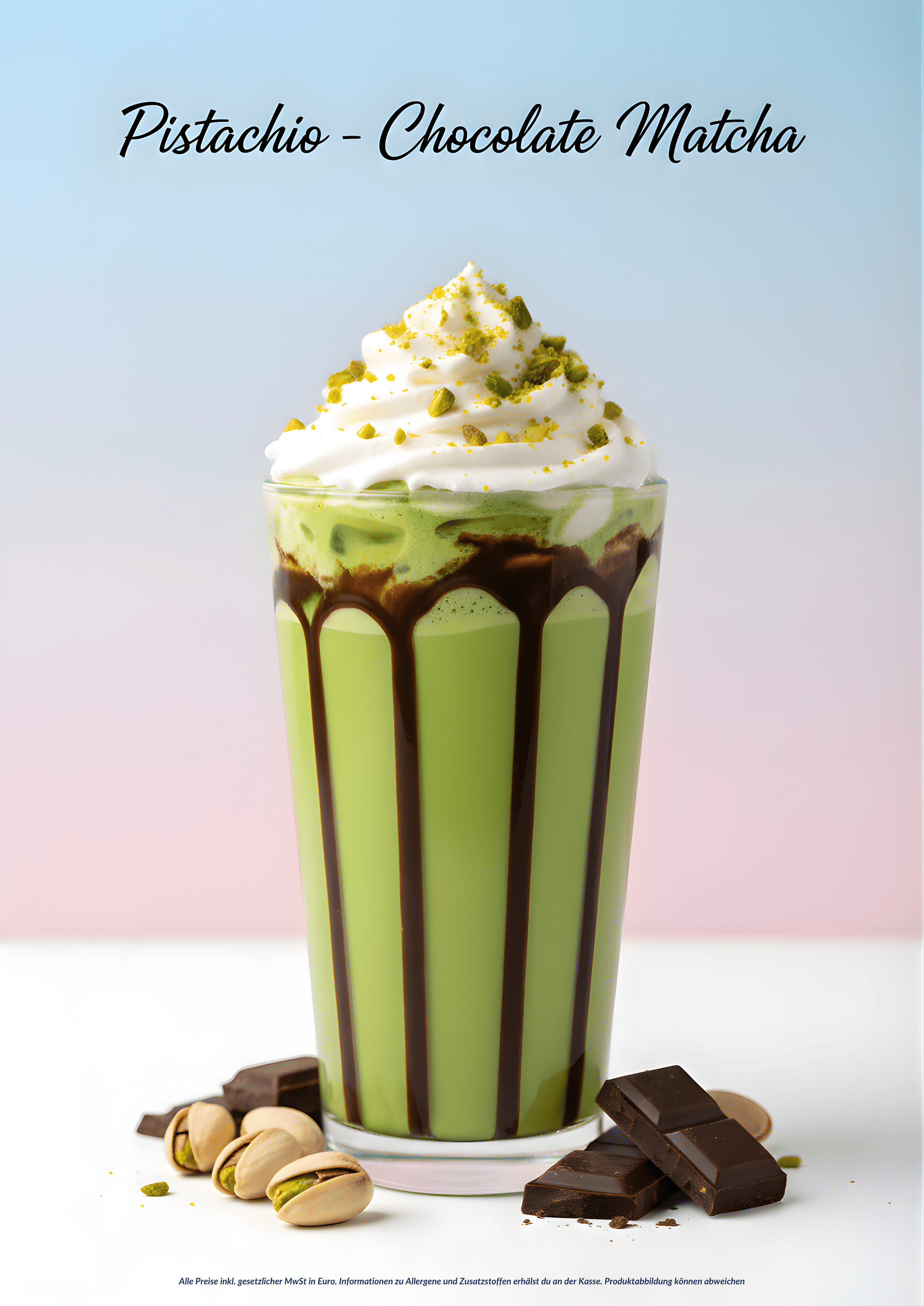
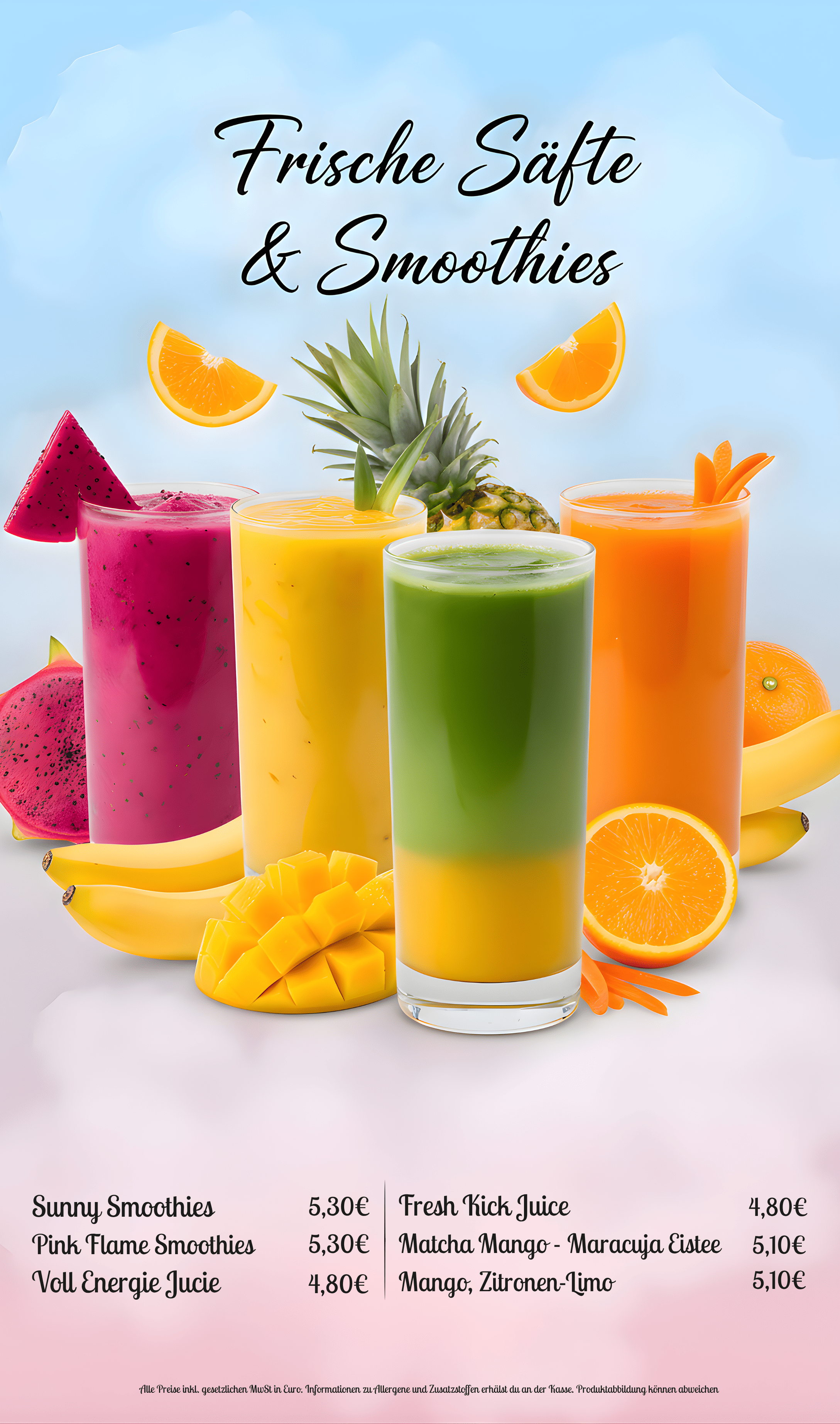
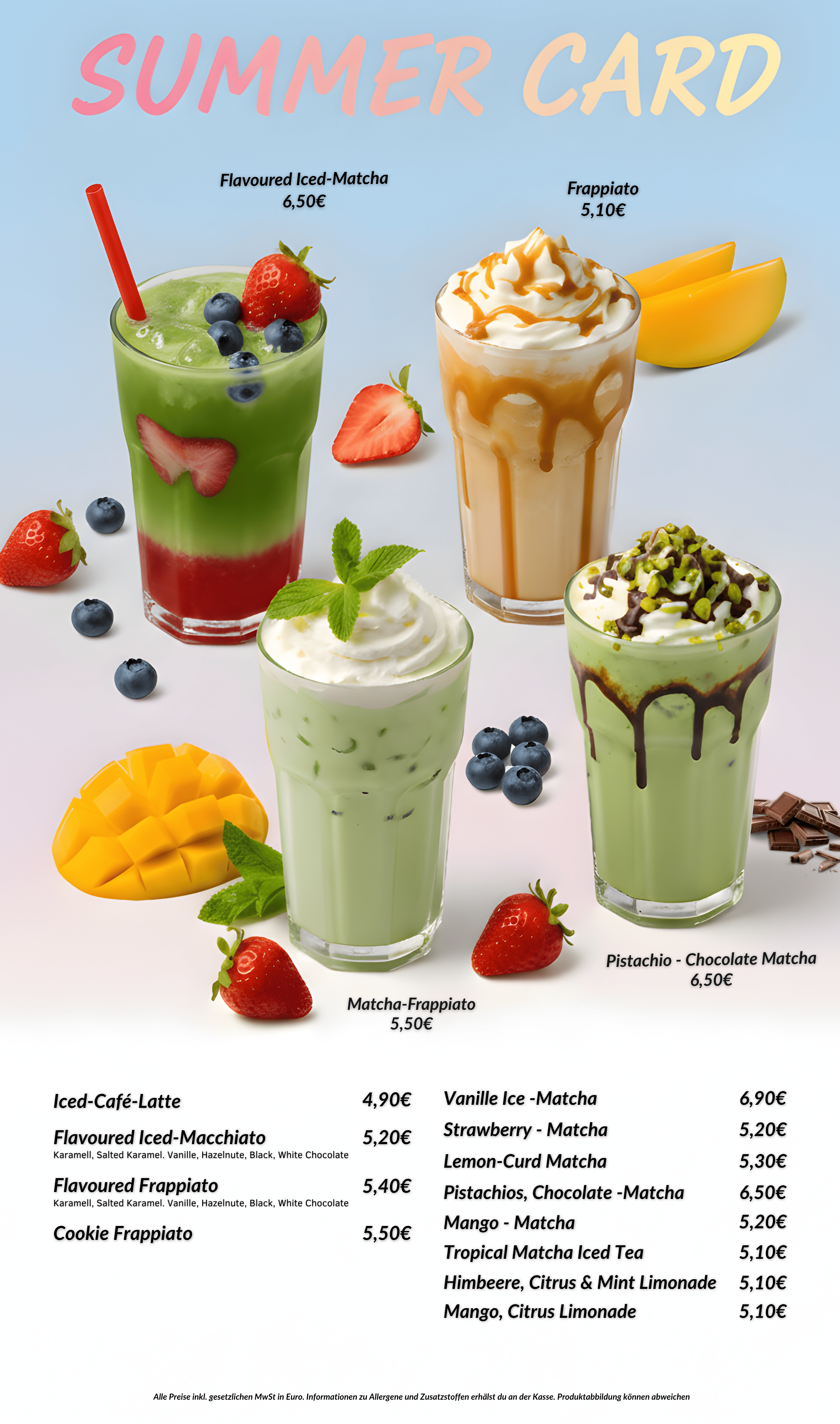
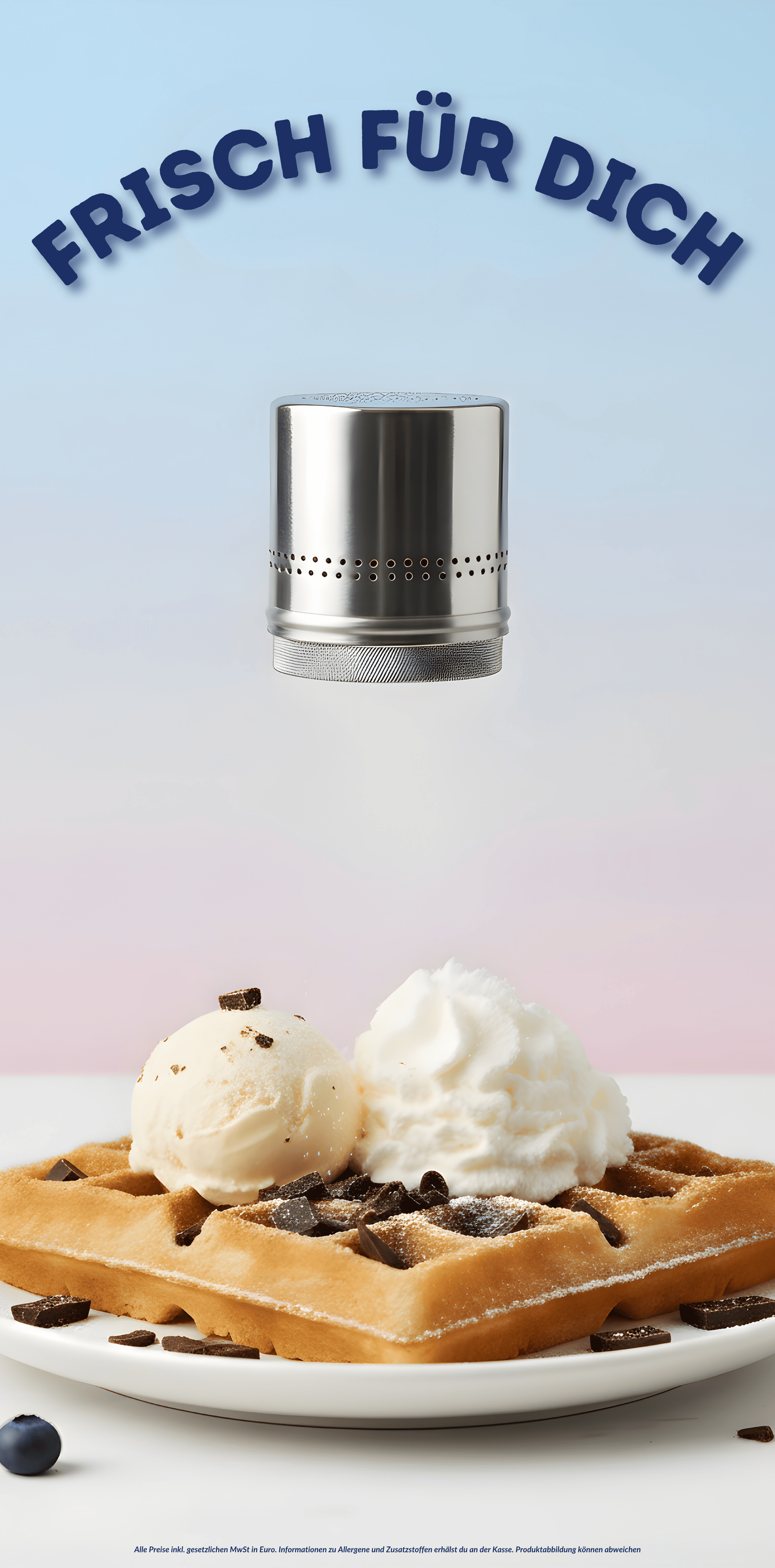
Print and in-store communication. Menus, menu boards, standing displays, packaging and a poster series. Every piece carries the same visual language. Someone who has seen OKI Street Café on Instagram recognises the brand on walking in. That recognition is the difference between dropping in by chance and coming here on purpose.
Social media. Continuous production with a fixed format logic. Reels that show the street café character rather than product shots without context. Imagery built to hold its own in a feed next to paid advertising from the chains.
Platform profiles. Google Business Profile, Apple Business Connect and TripAdvisor built out in full, with the right categories, platform-specific descriptions, good photography and consistent contact details across every listing. Someone searching for a café in the Colonnaden often decides inside the map result, before a chain ever enters the picture. An empty profile does not take part in that decision.
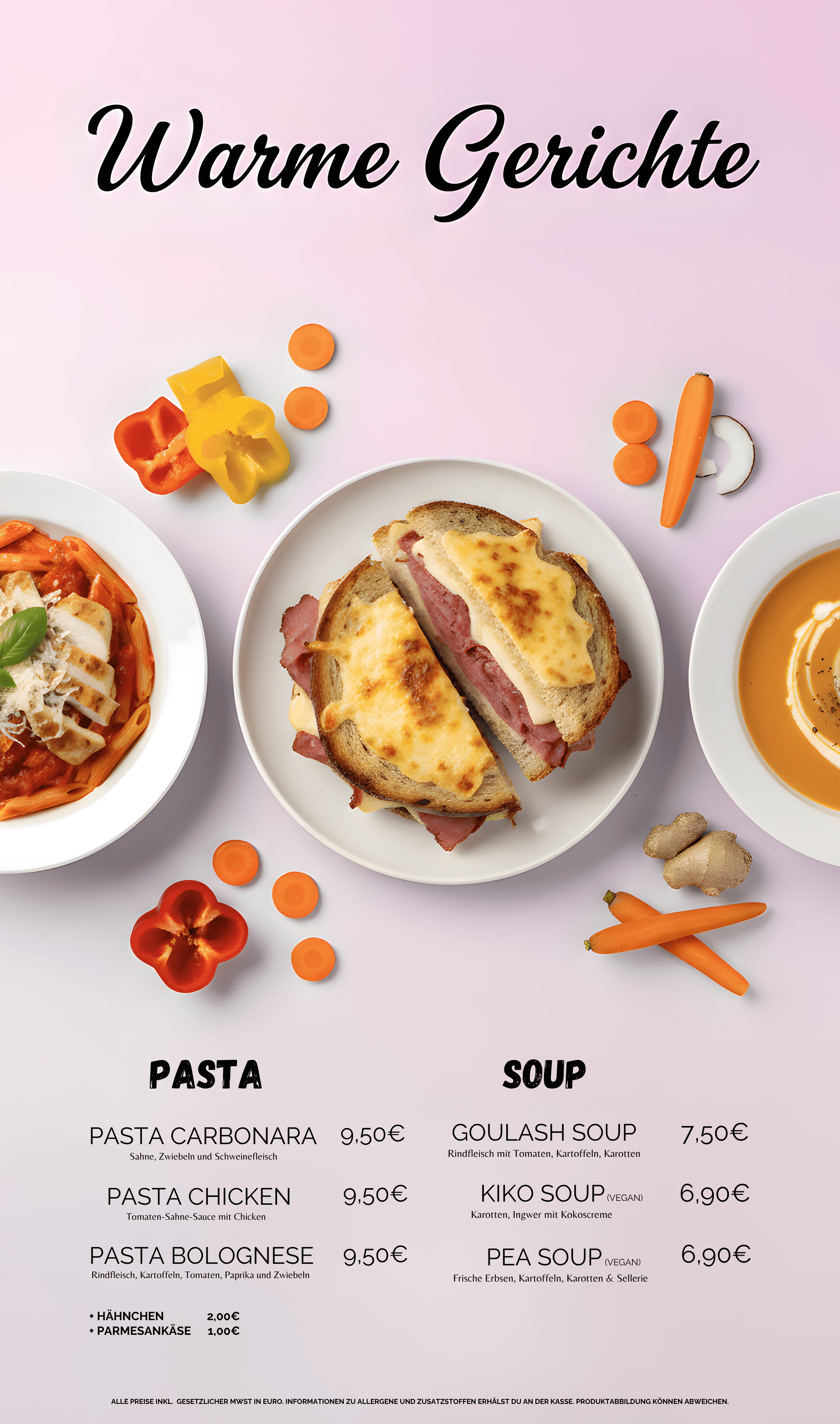
Alignment rather than separate measures. The leverage was not in the individual pieces but in the fact that they went live together. A guest sees OKI on Instagram, opens Google Maps, reads a review, walks past, recognises the brand on the sign, orders. Every one of those steps was previously empty. Strong design does little when the map profile is incomplete, and a well-kept map profile does little when social media looks like a different company.
Results
Revenue up 500 percent over [PERIOD]. The figure comes from the operator. Method and comparison period are in the next section.
4.9 stars from 205 Google reviews, as of 3 August 2026, publicly visible. Espresso House on Gustav-Mahler-Platz stands at 3.9 from 708 reviews, the Starbucks on Neuer Jungfernstieg at 4.0 from 2,199. The chains have more reviews. OKI has the better rating.
An address rather than an alternative. In the Colonnaden, OKI Street Café is no longer read as the cheaper option next to the chains. It is read as its own destination.
What this means for businesses next to large brands
The first instinct is usually to match them. Similar offer, similar feel, slightly cheaper. That rarely works, because scale advantages cannot be worked off.
The approach that holds is the other one: be recognisably different. Not in quality, which has to be right either way, but in identity, in tone, and in how the brand feels. That requires consistency across every touchpoint, because any single one of them can tip the decision.
For what a build like this costs and what drives the price, see our branding cost guide. For how visibility in maps, search and AI answers is built systematically, see our guide to AI visibility, AEO and GEO.
Sources
DEHOGA, the German Hotel and Restaurant Association, quarterly figures IV/2025: real revenue 14.8 percent below 2019, sixth consecutive loss-making year. DEHOGA half-year assessment 2025: food-led hospitality 17.4 percent below 2019 in the first half of 2025.
Google Maps, ratings and distances, retrieved 3 August 2026. Distances measured as straight lines between the listed coordinates.
Next step
If your location is better than your visibility, we will look at the identity, the map profiles and the channels, and tell you where the largest lever sits. Start the free analysis, three minutes, no obligation.
Similar results for your company?
Free analysis in 3 minutes.
Start analysisOr directly: +49 176 4047 1079